Monday, May 25
Monday, May 18
Great Packaging

At a dinner I recently attended ordered tea with my dessert. The waitress brought out a selection I had never seen before—Timothy's™. While I find the type something to be desired, I very much like the triangular packaging. I was also pleased that the tea bag itself was shaped as a triangle.
Finding a package which is suitable and aesthetically pleasing is always a challenge for a package designer. Additionally, creating a package that can be machined is equally as difficult if the end result is something other than a square. In this example, the designer was able to create a shape which would uniquely stand out in the standard tea box presented in a restaurant. It made choose this tea over packet teas. My only issue with this structure is that the tip gets easily damaged—see the Earl Grey package as an example.
This is a great example as to why a designer should always ask "What can I do to make this (insert type of project here) unique?"
Sunday, May 10
Papyrus- What will we do with you?
The SCBWI conference I attended was a smashing success. Great speakers and fabulous advice was abundant. Everything was going great until a speaker began his PowerPoint presentation and used a font so terrible I was distracted the rest of the day.

It was *gasp* Papyrus. I know you can feel my horror, but do you know why other that you've been taught to never use it?
Papyrus was developed by American designer Chris Costello in 1982 and was released by Letraset. Its goal was to feel like something handwritten on 2000 year old papyrus. Regardless of how I personally feel about the font, I can't argue that it missed its goal. The font does indeed give that feel. So what's the problem?
Papyrus has become the default font for any designer (or non-designer) who wants an elegant antique feel. This has led to the prolific overuse of the font over time. It's found on Arizona iced tea, Bakery signs, PowerPoint presentations and just about anywhere else you can think of. It also generally accepted that its usage is a clear indication that the user is not a trained designer. My students certainly know not to use it. In fact, they sometimes turn in "joke" projects using the font to see how long it takes for me to notice. The average time is .04 seconds.
When is it acceptable to use the font? It may be used for something that is representative of a 2000 year old papyrus manuscript. That's it. No exceptions. If you want an antiqued look, do it yourself by utilizing custom brushes in Photoshop. If you want it to look old, draw it by hand.
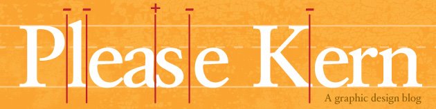
Saturday, May 2
A short word on dashes
Hyphen, en dash, em dash—what are they used for and why does everyone use the wrong one?
Hyphen
Used for split words at the end of a sentence and for compound words
ie. a hard-won fight
En Dash
Used to show passage of time and can be in replace of through or to. The En dash is a medium length dash. On a Mac, the key command is option + - (hyphen).
ie. Monday–Friday, 6:00–7:00
Em Dash
Used to show a change of thought within a sentence. It is a long dash and often replaces parenthesis or semi colons. On the web and in Microsoft Word it is represented by two dashes in a row. On a Mac, the key command is option + shift + - (hyphen).
ie. I pay the bills—he has all the fun.
Remembering to use the correct punctuation is key to a well-designed piece. It is important to take responsibility for the text even if you did not type it. Pay attention to the details—it saves time, revisions and makes you look better in the eyes of your client.
Subscribe to:
Posts (Atom)