
As a graphic design professor and freelance professional I come across so many things that make my skin crawl. Comic Sans, Papyrus, the use of Powerpoint to create a brochure, embedding a file in Illustrator instead of linking, creating a magazine spread entirely in Photoshop at 72dpi (type and all), but the thing that gets my goat most is poor kerning. Why?
It's about the details. If a student or design professional kerns it means they care. They care about detail, they care about doing a good job for their client or professor and they acknowledge that design is not just about "making things look pretty." It's about increasing the legibility and readability of the piece you are designing because ultimately another person will have to understand what you are presenting to them. Ultimately it needs to be functional. It may seem like a simple little thing and that one can "read it just fine" when the headline is not kerned. But doesn't it make it even easier to read when you do? Doesn't it look "prettier" when you do?
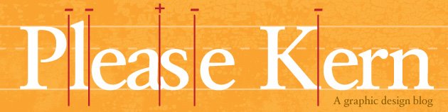
So there it is—out in the open—my biggest pet peeve. For the love of all things holy, please kern.
Unless of course you've used Comic Sans or Papyrus. In that case, please just drop my class.


No comments:
Post a Comment